Table of Contents
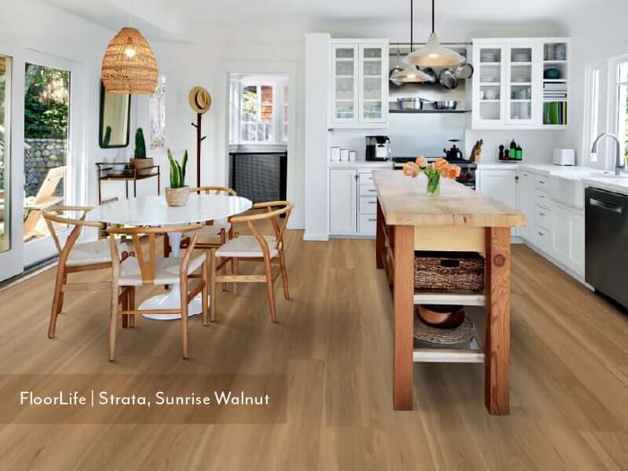
Rise of Mid-Tone Floors: Warm Hues Redefining Your Living Room
Envision cozy vibes. Popular living room floor colors come in honey, caramel, chestnut, and soft greige. These are hues that feel timeless yet forward-thinking. These mid-tone shades occupy a beautifully nuanced middle ground. They’re neither the bleached pallor of Scandinavian minimalism nor the intensity of dark Victorian era aesthetics that are dramatic and moody. Instead, they offer calm and cozy confidence. A visual warmth that anchors a room without overwhelming it.
Picture a wide-plank maple floor in a buttery, sun-kissed finish beneath a deep forest-green velvet sofa—a contrast that’s striking yet complementary. Or envision a chestnut herringbone laid beneath a soft white cabinetry that’s brushed with gold hardware. The interplay of tones creating a richness that no single element could achieve alone. These are the kinds of considered, layered interiors that mid-tone flooring makes possible.
They invite warmth without confinement. Cool or very light floors can feel clinical and detached while dark floors can make a room feel smaller and more somber. Mid-tones navigate both extremes with ease. The warm undertones of honey oak or caramel create an immediate sense of welcome. This means a room that feels inhabited and inviting rather than overly styled like a set piece.
They anchor without dominating. One of the defining qualities of a well-designed room is a sense of visual balance. Design components and elements that don’t compete or clash in terms of visual attention. A mid-tone floor provides this anchor. It gives the eye a place to rest, creating the foundation for other design choices such as upholstery, drapery, wall color, and lighting.
They enhance light. Warmer mid-tones have a lovely relationship with light, both natural and artificial. In a sun-filled living room, honey and amber floors seem to glow from within, adding brightness without the glare that comes with very pale or light surfaces. Under warm lamps or candles in the evening, colors like chestnut and caramel deepen beautifully, wrapping your home space in a sense of cozy and intimate warmth.
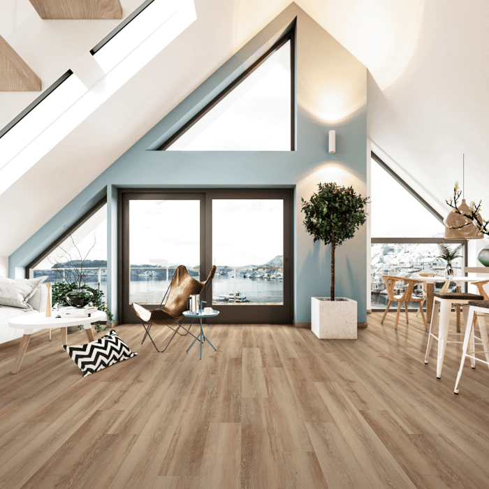
Design Tip: Luxury vinyl floors in the Belmont Hickory and Petronas Oak colorways by COREtec offer a great foundation for those seeking a stylish yet timeless mid-tone aesthetic. Crafted with realistic wood looks and outstanding textures—be sure to check out the full mid-tone collection exclusively at FlooringMarket.com
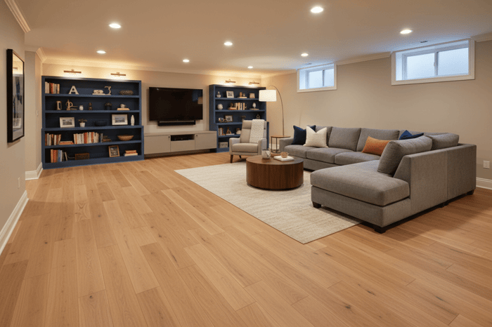
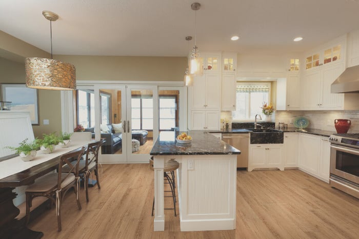
The Wonderful World of Neutrals: Versatility at Its Finest
Think beiges, grays, sand, off white, taupe, and even light browns. These are not the colors of compromise—but colors of mastery. Neutral flooring is among the most considered choices a homeowner can make. Especially when it comes to the living room, the heart of the home, where memories and celebrations are found profoundly.
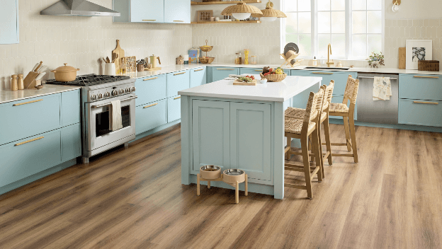
Celebrated by top designers and tastemakers alike for their unmatched versatility and enduring elegance. Far from playing it safe, today’s popular living room floor colors such as neutrals command attention precisely through their artful restraint. These floors offer a masterful foundation that allows every other element of a space to breathe, harmonize, and evolve. Whether refreshing a single room or undertaking a full-scale renovation, investing in neutral-toned flooring isn’t just a safe choice—it's a defining choice.
Design Flexibility & Modern Appeal. One of the most compelling reasons designers consistently return to neutral flooring is its extraordinary adaptability. Neutral floors never compete for visual dominance and functions as a blank canvas. These are colors that present a foundation that works harmoniously with many color palettes, furniture styles, or decorative pieces.
The Illusion of Bigger Space. Light travels through a room in ways that most homeowners never fully appreciate until they experience the transformative effect of a pale neutral floor. Light grey, soft beige, and whitewashed oak naturally reflect and amplify natural light, causing even modestly proportioned rooms to feel expansive, airy, and openly luminous
The Calming Effect. There is a reason that wellness retreats, luxury hotels, and mindfully designed residences overwhelmingly favor neutral palettes underfoot. The psychological impact of grounded neutrals embraces shades such as warm ivory, dusty taupe, and hushed greige have a measurable calming effect on the nervous system. These colors gently anchor a room in serenity rather than stimulation. In an era defined by overstimulation and relentless visual noise, the home has become our most essential oasis. A neutral floor is an intentional choice to cultivate an environment of ease and lasting peace.
Design Tip: Engineered Hardwood designs such as Empire Oak Aster and Americana Oak crafted by the well renowned Shaw Floors are two exceptional choices to start off with. This season, curate your neutral palette mood board with floors thoughtfully constructed with genuine hardwood veneers, delivering the timeless character of solid wood while offering enhanced resistance to moisture and everyday wear.
Experience Beautiful Floors, No Matter What Life Tracks In
Discover the iconic collection today. All crafted with outstanding sustainability standards designed to promote well-being for people, pets, and the planet. From the whiskey-toned richness to deep saddle walnut, each plank is engineered to deliver the authentic grain, texture, and depth of real hardwood without any of its vulnerabilities.
Engineered hardwood offers the warmth and timeless grain of real wood with the dimensional stability to perform across every room and climate, while Shaw's tile and stone selections bring an architect's sense of permanence and refinement to kitchens, baths, and beyond
Learn More About FlooringMarket
Founded in 2005 by a team of passionate flooring experts with decades of experience. Since then, we have grown into a trusted nationwide source for flooring solutions, supplying millions of square feet of flooring to customers across North America and worldwide.
Read more about trends, styles, details, and knowledge about flooring. Visit our learning center where you can find our insightful blogs—perfect for finding your next home inspiration.
FAQs
What makes mid-tone floor colors more visually dynamic than neutral floors?
Think warm honeys, mid-tone yellows, dusty taupes, or muted sage-toned woods that occupy a visual "sweet spot" that neither fades into the background nor dominates a room. They add inherent character and dimension, giving a space a grounded, lived-in warmth that pure neutrals like stark white or cool grey can sometimes lack. The subtle depth of a mid-tone pulls the eye downward, anchoring furniture and decor in a way that feels intentional and curated rather than default.
Are neutral floors more versatile than mid-tones when it comes to decorating?
Neutral floors are often celebrated for their versatility. Light blondes, cool greys, and whitewashed finishes work across a wide range of design styles without competing with furnishings. The key difference is that neutrals offer a blank canvas, while mid-tones offer a starting point with personality—one that can actually make decorating decisions easier by providing a built-in tonal direction.
What are the practical benefits of choosing a mid-tone floor?
Mid-tone floors strike an ideal balance in day-to-day livability. Unlike light floors that show every grain of dust and dark floors that highlight pet hair and fine scratches, mid-tones are remarkably forgiving. They mask everyday wear, minor scuffs, and dirt between cleanings, making them a smart choice for high-traffic areas, families with children, and pet owners.
How do neutral floors each affect the perceived size of a room?
Neutral floors (particularly light ones) are a well-known design tool for making rooms and spaces feel larger, brighter and more expansive. The reason is that neutrals reflect natural and artificial light rather than absorbing it.